


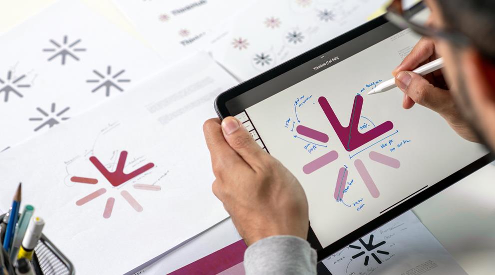
Logo
A mark that works on a facade of four meters and on a button of fourteen pixels. In all file formats, with variants for dark and light backgrounds.
Logo, colors, fonts, printed materials and presentations. So that your company looks the same everywhere, from your facade to your invoice.
Then the logo on the invoice looks slightly different than on the site, everyone uses their own blue, and every employee makes their presentation in a different font. That doesn't look messy in one document. But it does with fifty.
A corporate identity is not a logo. It is a set of agreements that makes your company look the same everywhere, even when someone else creates something for you.
We put those agreements on paper and provide the templates. This way, everything remains consistent, even after three years and also when someone new starts.
A logo is
the beginning, not the end.

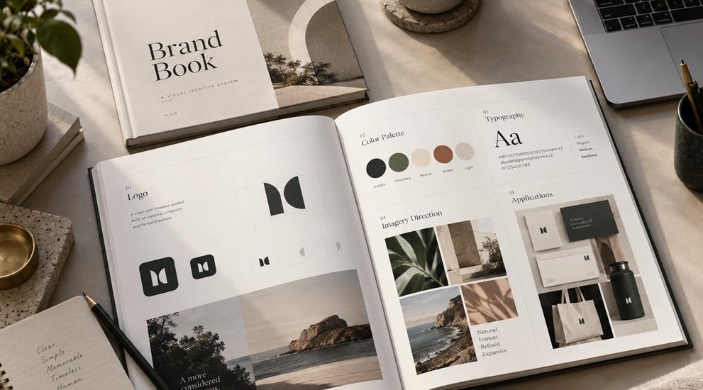
Many corporate identities die a quiet death in a folder on a server. Beautifully designed, but no one knows which file to take, so everyone reverts to the old logo from an email three years ago.
That is why we not only deliver the design but also the templates: presentations, stationery, quotes, social messages. This way, it remains correct when we are not there.
See also websites and webshops en photo.
Being consistent looks
more expensive than being expensive.
Expect three to five weeks from the initial meeting to the finished file, a large part of which is waiting for feedback. A complete corporate identity with brand book and templates takes six to ten weeks.
No and that is usually not necessary. We create a sequence: first what everyone sees, so your website, your email signature, and your business cards. Print materials and stickers follow when the stock is depleted or the vehicle is replaced.
Two or three directions, each with its own idea behind it. After that, we further develop the chosen direction. Showing twenty variants of the same does not help anyone move forward; then the choice is made based on the flavor of the day.
A document with all agreements: which colors with which codes, which fonts, how much space must remain around the logo and what you should definitely not do with it. It is the reference work that your team and your suppliers can refer to.
Often that is the better choice. Throwing away a recognizable logo costs you years of built-up recognition. We will see what stays and what can evolve with the times.
We design, monitor the printer and check the proof. If you want to work with your own printer, we will provide the files as he needs them.
We do the design, the installation is done by a fixed installer. We ensure that the dimensions and colors are correct, because a logo on a delivery van follows different rules than on a screen.
For daily work, yes. You will receive templates for presentations, quotes, and social messages in which the style is already established. For new print work or a new application, we will look at it together in the best way.
The place where everything comes together and where the application comes in.
Ensure that you are found when someone is searching.
Stay present where your customer spends their time.
A picture that sticks, from corporate film to reel.
Your company, your team, and your products at their best.
The texts that do the work, on your site and beyond.
